Turn on HGTV and it will be obvious that the right design can lead to some incredible spaces. On Fixer Upper, Chip and Joanna Gaines combine modern, rustic, and natural elements into a streamlined design. On Property Brothers, Drew and Jonathan Scott flip homes, choosing modern layouts with clean lines and splashes of color. The results are both timeless and breathtaking. But what does this have to do with your photography business? The reason these shows are so successful is that their interior designers go into each project with a clear, strong vision of the outcome, and they make their sales based on this vision.
It’s time to start thinking like an Interior Designer.
Inspiration is key but every room needs a focal point.
A strong focal point not only attracts the eye, it ties in the room’s furniture and decorations. You want this focal point to serve as a centerpiece. It should be dominant and interesting, without detracting from the room’s functionality. Help clients fix a “boring” room by using artwork as their new focal point.
 Steer your clients towards the newest trend in interior design.
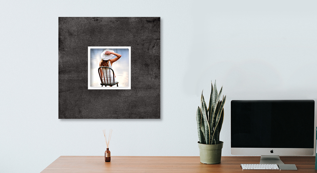
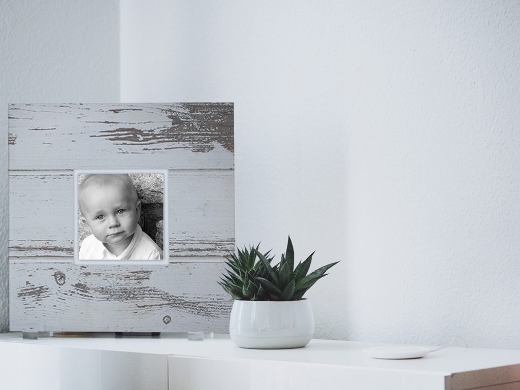
The best artwork is one that is highly personal, like ones featuring beautiful professional portraits of your clients family. Add on Museum Prints to your packages and offer something truly unique for their homes. Rather than using a large image with a thin mat for framing, Museum Prints use a smaller image with an oversized matte to create a stunning, visually-appealing focal point for any room. Your clients will be “wowed” when they receive their extraordinary new wall art.
Improve sales by reinforcing the importance of “mood” and “balance” within your client’s space.
They say a picture is worth a thousand words. Depending on how your pose your clients and how you edit their pictures, you can create totally different moods for your images. Help your client choose the best images for their space by basing it on the mood they want to create. For a fresh, airy look, choose images that are lighter in color and offer a “dreamy” effect. For a bolder look, offer images with higher contrasts and dramatic lighting. Museum Prints come in a variety of sizes, colors, and textures to fit any style.
And don’t forget the “rule of three”. Rather than narrow down your client’s choice to a single image, choose multiple images and play around with different scales, proportions, and symmetry. When in doubt, mixing and matching sizes to create an asymmetrical look will add depth and creativity to any space.


